When we see a brand for the first time, we make a decision in a second whether the brand is good or not. Our mind makes this decision very fast. But how? By seeing the brand color. Color plays a very important role for every brand.
When we see any website, social media page, or logo design, at first, the color gets attention. And after that, we read the words. That’s why colors are more powerful.
Color psychology in branding means using the colours to control the emotions and feelings of people. Some colors make us happy, some build trust, and some create excitement. A brand uses color to createn a image in the minds of the people. In this blog, we’ll discuss how the colors work and how the brand chooses the best colors.
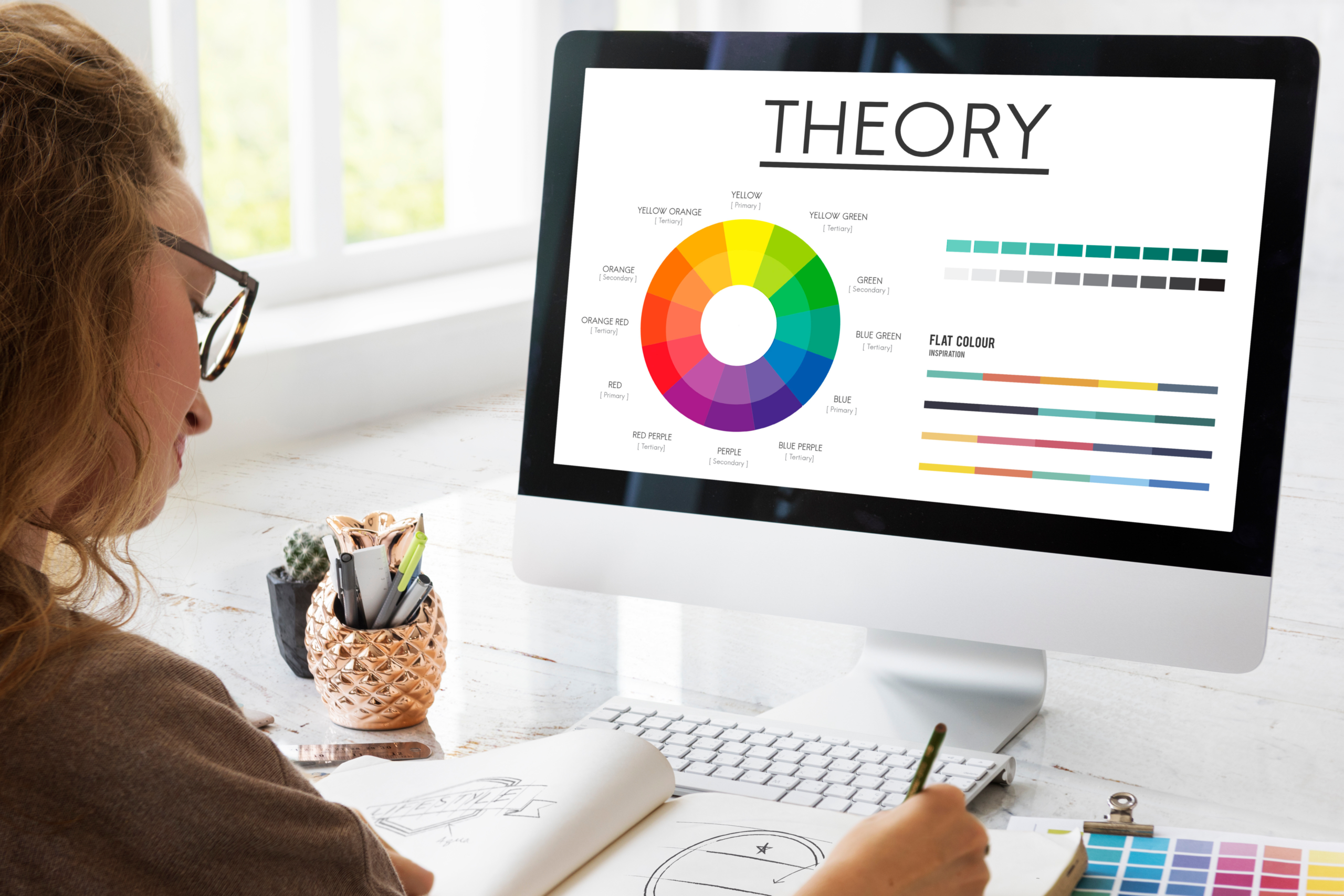
What is Color psychology in branding?
Color psychology in branding is a simple idea. This means every colour delivers its own feeling. Means when we see any specific color, we feel something after that.
Like:
- After seeing the blue color, we assume the brand is safe and trustworthy.
- Seeing red makes us feel excited or in a hurry.
- Seeing green brings the mind towards nature, plants, and health.
Brands know people feel emotions through colors. This is the reason they don’t choose the colors in a random manner. Color psychology in branding helps brands to understand the emotions of people and to make a connection with them. If the brand’s colour is good, then peoples loves the brand and keep the specific name of the brand in mind for the long term.
Role of Color in Brand Identity
Every brand has its own unique identity. Just as we recognize people by their clothing and style, brands are recognized by their colors.
When the same colors are used by the brand everywhere—logo, website, ads, social media—people remember that brand easily. This color psychology is an important part of branding.
Color is like a short way that tells a story about a brand:
- Bright colors mean fun and energy
- Dark colors mean serious or luxury
- Soft colors mean calm and simple
It’s not only the color of the logo that is important. Brands have a complete color set, called the brand color palette. This makes the brand appear the same everywhere.
How Colors Make People Feel
Colors don’t just look, they also make people feel. That’s why color psychology in branding is so powerful.
Warm Colors
Warm colors are red, orange, and yellow.
These colors convey energy and excitement.
- Red – evokes action and hunger.
- Orange – evokes friendship and fun.
- Yellow – gives rise to happiness and brightness.
That’s why warm colors are used in food brands, games, and sales posters. These colors attract people.
Cool Colors
Cool colors are blue, green, and purple.
These colors convey a feeling of calmness and trust.
- Blue – trust and safety
- Green – health, nature, and growth
- Purple – creativity and a royal feel
Banks, apps, hospitals, and education brands use cool colors. This is a perfect use of color psychology in branding.
Neutral Colors
Neutral colors are black, white, and gray.
These colors look simple, clean, and classy.
Luxury brands use neutral colors because they give a premium and timeless feel. Neutral colors also make other colors look better.
Meaning of Popular Branding Colors
According to color psychology in branding, each color has a meaning:
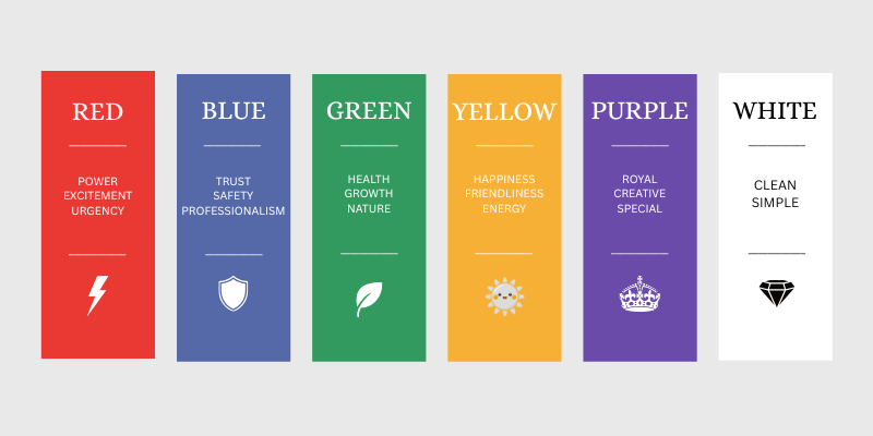
- Red – power, excitement, and urgency
- Blue – trust, safety, and professionalism
- Green – health, growth, and nature
- Yellow – happiness and positivity
- Orange – friendliness and energy
- Purple – royal, creative, and special
- Black – strong and luxurious
- White – clean and simple
Brands choose these colors thoughtfully so that people understand them correctly.
Colors and Different People
Not everyone thinks about the colors the same way. Color psychology in branding also considers who the audience is.
- Children prefer bright colors.
- Adults prefer soft and simple colors.
Colors have different meanings in different countries. Therefore, brands first understand their audience and then choose colors. No single color is right for all brands.
Choosing the right colors for a Brand
For choosing the best colors, the brand should answer some questions like:
- What do I want people to feel?
- Who are our customers?
The main color of the brand is the primary color. Other than that, all support the design. And too many colors are not a good way. Only simple and limited colors look good.
All these things are a part of Color psychology in branding.
Common color mistakes
Some common color mistakes:
- Inconsistency: Following different colors on different platforms undermines the brand value and trust. By this, it’s difficult for an individual to keep the brand identity in mind.
- Following trends blindly: Colors that are trending might not match the brand’s actual message or the needs of the audience, which leads to regret.
- Personal aspect: Choosing colors as per personal preference rather than the psychological effect.
- No clarity: If the contrast is not good, like grey on a white background, is not understandable by the audience.
Color Psychology in Digital Branding
Color psychology is important in branding for websites, social media platforms, and mobile apps. The color of a button determines whether a user will click on it or not.
Using proper and consistent colors on social media helps brands remember. The contrast between the text and the background should be clear so everyone can read easily.
Real-Life Brand Examples
Big brands use colors smartly:
- Mainly, brands related to the tech industry use blue to build trust. For example: HP, Samsung, etc
- Food brands use red to increase appetite. Like, Pizza Hut, NESCAFE, Coca-Cola, etc.
- Luxury brands use black for a classy look. Like, Apple, GUCCI, adidas, etc.
Small brands can also achieve strong branding by following color psychology.
Conclusion
Color is not merely a matter of being attractive and beautiful. Colors leave an impression on the emotions and feelings of people. Color psychology in branding causes brands to be memorable, strong, and trustworthy.
If brands adapt the right colors, people like and remember the brand. Therefore, always use colors wisely—because the right color can become a brand’s strength.
Also read: